

FACULTY STORY: Ian Lynam
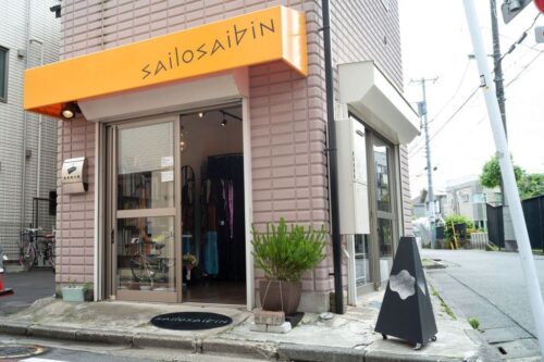
Ian Lynam is a graphic designer, writer, owner of the boutique Sailosaibin, and a VCFA MFA in Graphic Design faculty member. Based out of Tokyo, Japan, Lynam runs his own design studio creating for popular brands such as the video game series Dota 2, Disney Channel (Japan), Nestle Toll House, and more.
Lynam is the author of several books examining the various cross sections of design, including The Failed Painter (Set Margins 2023), The Impossibility of Silence: Writing for Designers, Artists & Photographers (Set Margins 2023), his most book War with Myself: Essays on Design, Culture & Violence (Set Margins 2024), and many others. Lynam’s next publication will be a “hybrid textbook/coffee table book called Fracture: Japanese Graphic Design 1875–1975 poised to come out via No Place Press in the U.S. It will be the definitive history of Japanese graphic design in English weighing in at nearly 500 pages.”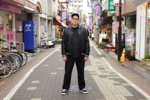 His current work in progress is a book about how to make books for designers, artists, photographers, and everyday readers.
In the summer of 2024, VCFA chatted with Lynam about his time teaching at VCFA in the MFA in Graphic Design program, his unique approach to the VCFA mentorship model, and his love for typography and type design. Read excerpts from our interview below, and learn more about Lynam at ianlynam.com.
The Interview
Q: How long have you been teaching at VCFA and what year did you first start teaching?
A: I started teaching at VCFA over 11 years ago—way back in 2012!
Q: How do you approach the unique VCFA mentorship model? How do you specifically work with your students each semester?
A: I encourage the students to emphasize our student-centered approach and explore aspects of culture that they are interested in, but to try to go deep—to find out things about their interests and about graphic design that they might not have known. For example, one of my favorite graphic design anecdotes is that the design educator and type designer Frederic Goudy is the only graphic designer known to have fallen asleep smoking in bed twice and to burn down his own house containing his home office twice—knowing the odd bits of history, especially the strange facts, will keep graphic design interesting and meaningful. And the only way to find these things out is to research.
In terms of specifics, I start out each semester by asking the student to make an exhaustive list of 100 big and small things that they would like to explore in the upcoming semester—the majority should be somehow related to graphic design, and the rest should be things that they would like to do to enhance their lives. That gives us a roadmap for the semester and gives them a resource/inspiration list to return to when they feel out of juice. I also ask them to leave some items blank so that they can pivot at any time.
We then discuss their interests and I provide them with the program reading list. They check off everything that looks of interest to them and I provide PDFs of initial readings, plus they procure books from the VCFA Library, and we are off and running! Following that, they research, write, and make things for a month and then they submit their work in the form of a digital “packet” (usually a PDF), I review it and provide comments and additional readings, then we meet up and talk about the work and how they might push things further. The rest of the semester follows this pattern.
Q: What’s something you always try to emphasize to each and every student you work with?
A: I try to emphasize their value and that they have a unique voice that others want to hear. Graphic design is a vocation in which designers usually give form to other peoples’ content and graphic designers often feel lost and voiceless due to that. It is my job to be an ally to designers of all stripes and to help them articulate themselves in the world and exert as much agency as possible.
Q: How has the mentor-to-mentee experience impacted and shaped you as an artist and professional?
A: My experiences at VCFA have bolstered my sense of independence, my empathy for others, have made me a better listener, and have helped shape my career in so many ways. Being able to connect with so many different kinds of people has helped strip away a lot of my negative character traits and have helped me feel a deeper sense of connection to humanity. (This sounds cheesy, but I mean it—teaching at VCFA has been one of my life’s greatest gifts.)
Q: Do you have a favorite VCFA memory or story you still carry with you to this day?
A: I live in Tokyo, Japan and the morning after I returned from my very first residency, I was making a coffee in my kitchen and trying to explain the immensity of my experiences to my wife and I just started bawling my eyes out—I had found my people: people who cared about design and community in the passionate ways that I did, but I had just as much found other design educators who had begun teaching me very different ways to approach design and design teaching. That first residency was transformative to me in so many ways.
Q: Typography and type design have been a distinct corner of your career. Can you speak more about how they came to you as a focus in your work?
A: Like many VCFA students, I went back to school later in life. I was 27 when I returned to finish my undergrad degree and subsequently my MFA. In one of my first undergrad graphic design classes, one particularly thoughtful teacher showed us posters designed by Jan Tschichold and Piet Zwart—both of these designers’ work utilized an indescribable-to-me-then approach to space and typography and lettering design. Each of their works considered every aspect of these things and I was dumbfounded. I wanted to make work wherein every single element was considered and when possible, for every element to be made by me instead of just using other peoples’ fonts and imagery. That is what kicked my mutual exploration of typography (designing with fonts) and type design (designing fonts). I am interested in making things that are of my time, but as an American living in Japan, they probably don’t look so much like what Americans are making in America, as my cultural context is different than most Americans.
 Q: You recently worked on a custom typeface for Nestle Toll House, Ruth’s Recipe. How did this project come across your table, and what was your process like for this particular typeface?
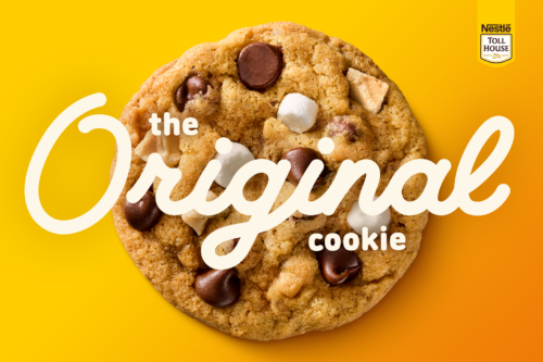 I was approached by an advertising agency in Southern California who had secured the Nestle Toll House account and they needed a new typeface for their client. The typeface was based on the handwriting of Ruth Wakefield, the creator of the chocolate chip cookie. I worked on the typeface for a few months iterating how different letterforms might look, incorporating stylistic alternate characters galore while modifying everything according to client feedback and pushing the typeface to be as tight as possible.
Q: You also recently mentioned that you’re designing new typefaces, as well as updating old ones from your type foundry, Wordshape, and that you and your collaborators have released 13 new type families over the past year. We’d love to learn more about this work. 
A: Type design has been going through a wave of technological development over the past decade, notably with the emergence of variable fonts—font files that contain a whole family of typefaces in one file that you can modify the weight of incrementally.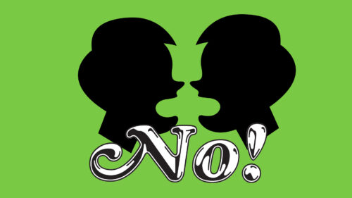 I’ve been taking older (and newer) typeface families and making variable fonts out of them, giving people who use my fonts a ton more control over the nuance of how they want their own typography to appear and work.
My absolute favorite typeface that I’ve released over the past year is called Cooper Chrome Italic Pro. I really love the font Cooper Black, especially the swash caps of the original Italic. I also really love the font Chromium One. One day I was thinking, “What would a mashup look like? Something that looks and feels like early 1980s BMX culture.” And this weird/retro/very silly typeface came out of it. It involved way too much drawing!
Q: Working in type over the years, how have you seen your style, practice, and craft grow? Where do you hope your art goes next?
A: Shortly after finishing graduate school, I moved to Japan, where the questions and assumptions about graphic design are quite different from what I had learned in America. There is much more of a cultural appreciation for graphic design in Japan, as well, so my cultural context pushed me to continue to stay focused on stylistic development.
Simultaneously, Japan’s corporate culture is brutal—folks tend to work long here hours-wise, though not necessarily “hard”, as the durational qualities of clocking in 16- to 18-hour days offers its own difficulties. I figured out quickly that I didn’t want to work in traditional agencies or design studios in Japan due to the long hours, so instead I started my own design studio and took up teaching design, as well. Having a mix of incomes has been really helpful and has led to a multi-flavored practice that is both humane and stable. It allowed me to truly enjoy both making design and teaching design instead of just ‘grinding out’ work due to deadlines. I can say “no” to anything anytime client-wise and I only say “yes” to projects that are meaningful to me and/or that have a decent budget attached to them. Part of that is definitely privilege, but part of it is that I worked differently than is expected for decades.
As for the future, I am working on multiple book projects and I am excited for those to come out. I kind of already hit all of my career milestones nearly 20 years ago, so everything in the future just feels like an exciting possibility!
 Q: Where can people find and support you and your work?
A: My design studio website is ianlynam.com. You can check out my typefaces and assorted publications at wordshape.com. If you find yourself in Tokyo, stop by our shop Sailosaibin in Sasazuka. We sell apparel, books, and weird stuff that you can’t find anywhere else in the world. (It’s right next to the stream full of ducks and turtles—hard to miss!)